Headmap Psychology
New logomarks and visual identity
-
Client
Headmap - Year
2024 - Category
Visual identity
Problem
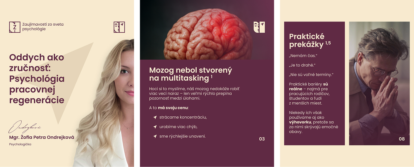
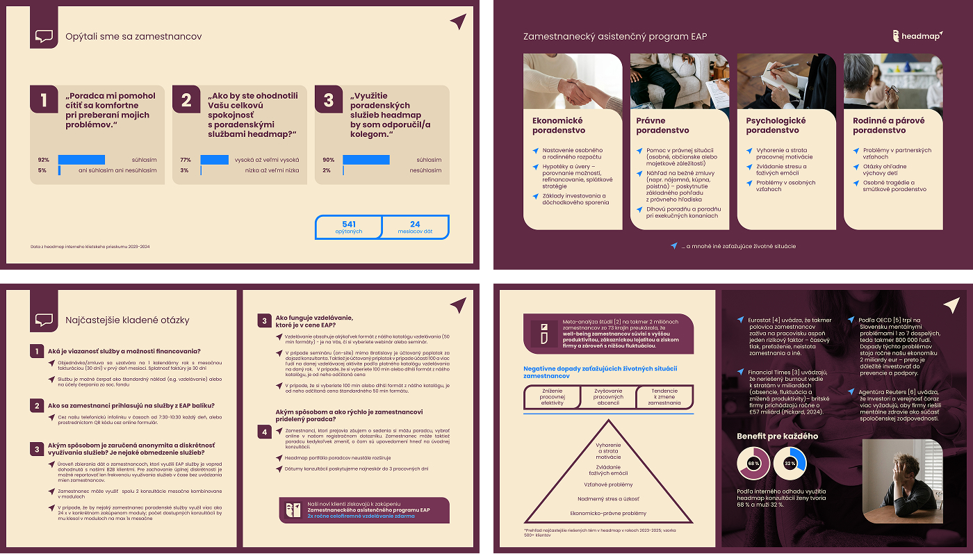
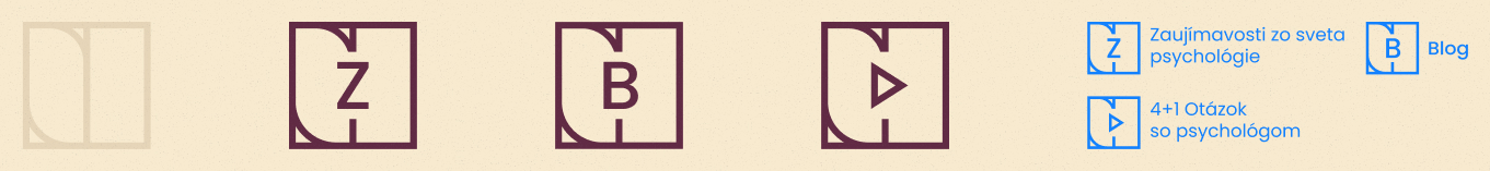
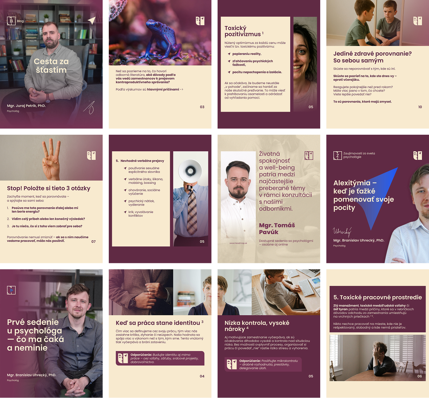
Headmap specializes in counseling and occupational psychology, as well as the recruitment of new employees for companies. Its core motto is: psychology, competence, growth. Since its founding, the company has used the Greek letter psi (Ψ) as its logomark — a symbol widely recognized as representing the field of psychology.
The issue was that psi is an overused symbol in this field — something the client was well aware of. They leaned toward a final design that would be based on a different, more distinctive concept. I welcomed the challenge.
Solution
In designing the logo, a visual intersection between psychology — the science of human thinking and behavior, then professional competence in the field, and a strong focus on continuous growth and forward momentum was essential.
I came up with two key symbols to represent the values and focus of Headmap. The first is the head of a stoic individual — calm, reflective, embodying an ideal state that Headmap aims to guide its clients toward. The second is a compass needle, symbolizing direction, clarity, and the path toward personal growth and progress.